 Home
Home
Download all (PDF+PNG), 76MB
Download guidelines (PDF), 8MB
Paper
Cheat Sheets for Data Visualization Techniques: Zezhong Wang, Lovisa Sundin, Dave Murray-Rust, Benjamin Bach, ACM Conference on Human Factors in Computing Systems (CHI), 2020By Type
Anatomy | Introduction | ConstructionVisual Pattern | Pitfalls
Well-known Relative | False Friends
By Visualization
 Boxplots
 Confluence Graphs
 Adjacency Matrix
 Parallel Coordinates
 Time Curve
 Treemap
 |
 |
Cheat Sheets for Visualization Techniques
Cheat sheets are sets of concise graphical and textual explanations, inspired by infographics, data comics, and cheat sheets in other domains. Cheat sheets aim to support learning, teaching, and the regular use of both common and novel visualization techniques in a variety of contexts. To design cheat sheets for visualization techniques, we describe six components of a cheat sheet: anatomy, build-up, visual patterns, pitfalls, false-friends, variations. We present examples for several visualization techniques, created through an iterative design process which involved data science and visualization teachers, visual designers and students. In a qualitative and iterative user study, we gather subjective feedback from participants, show readability and usefulness of our cheat sheets, and iterated on their design. We bring this together as a design methodology, with a comprehensive design framework to easily create cheat sheets for additional visualizations.
By Type
Anatomy
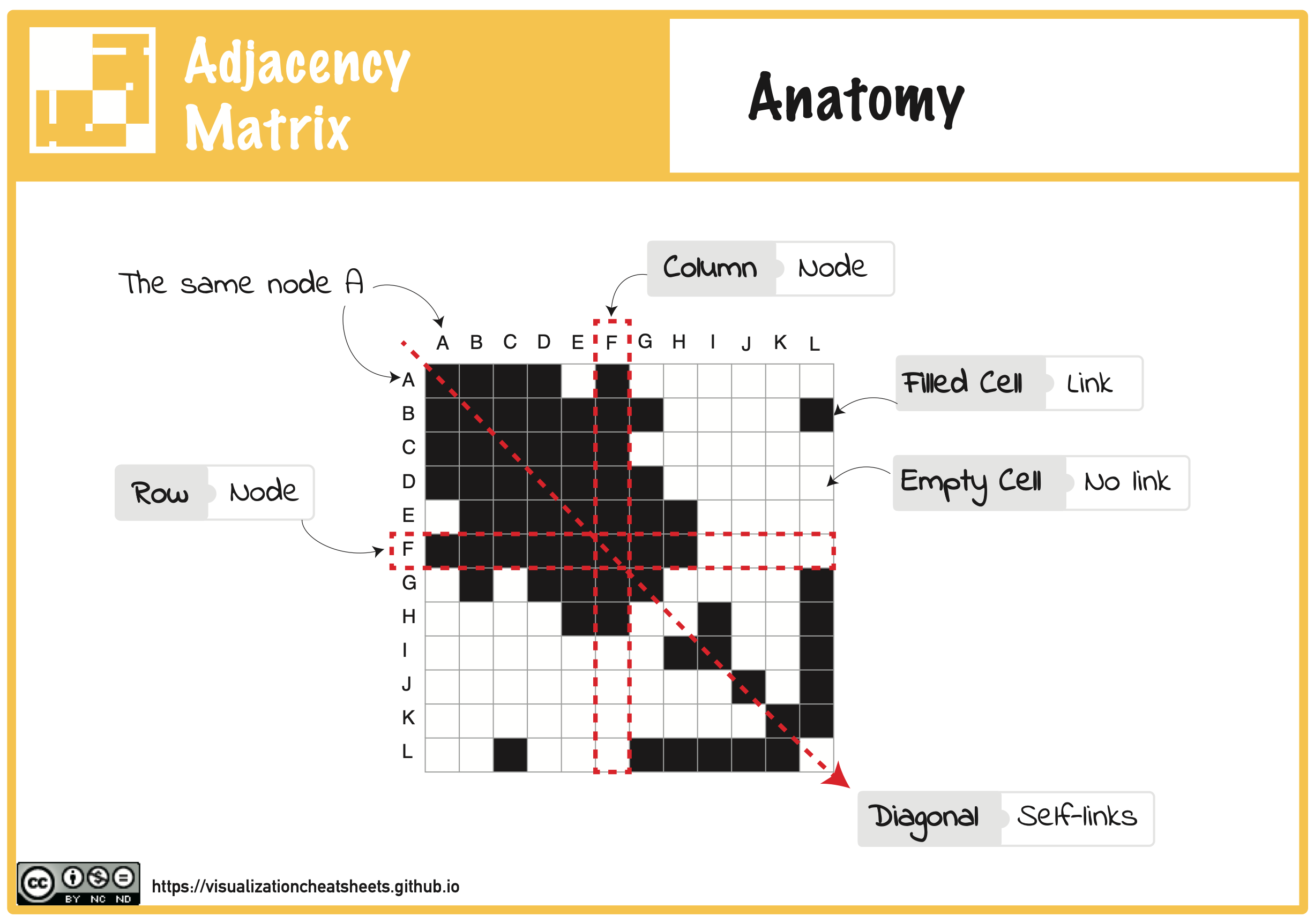 Anatomy explains the visual elements of a visualization technique, their composition, their specific terminology, and how they relate to the data. The visual components of a visualization can include individual visual marks as well as groups of marks, axes, locations in a visualization etc.
Construction
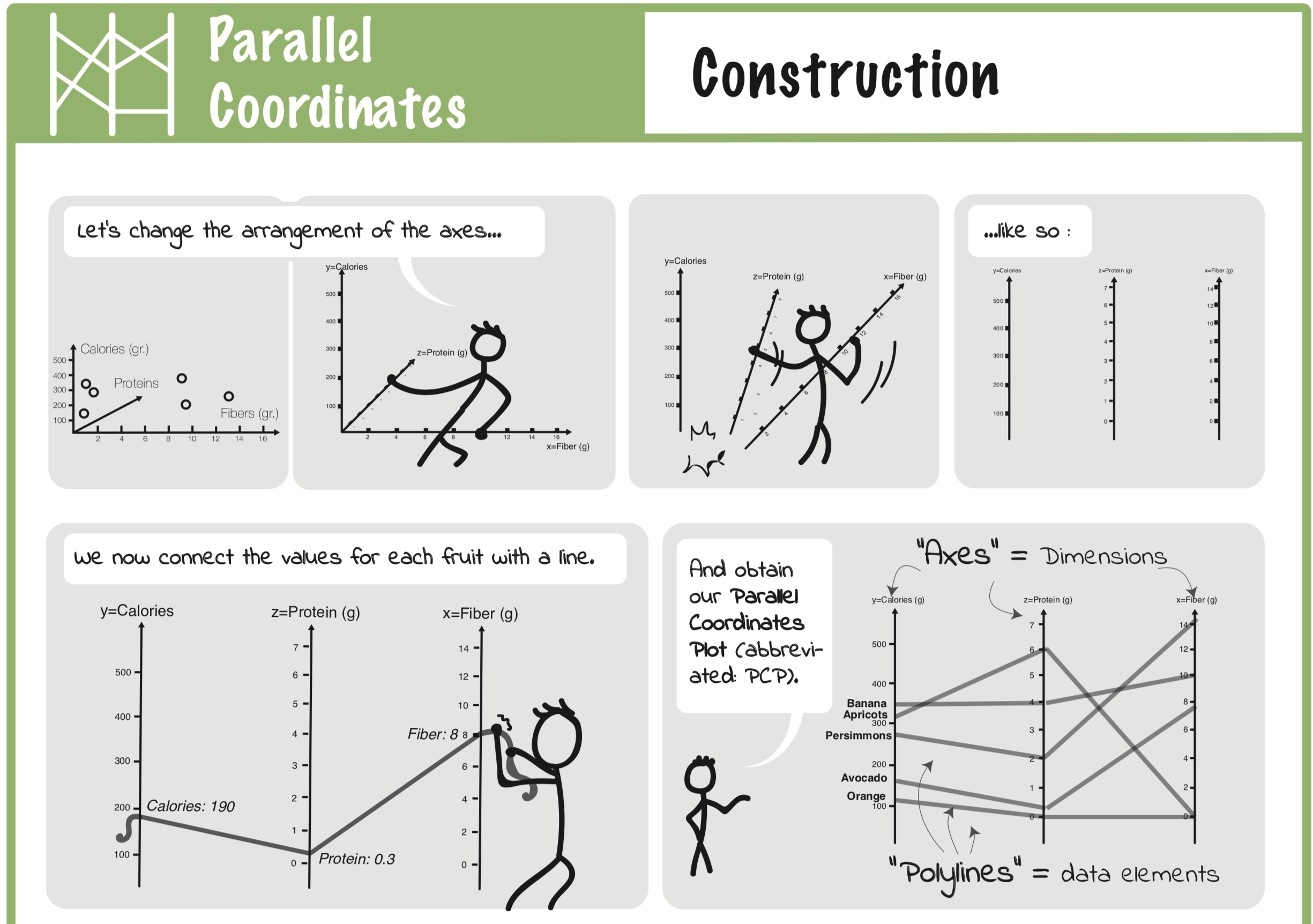 A Construction explains the conceptual idea behind a visualization design and how a visualization is encoding data. We chose that term to highlight the step-wise explanation used to understand a visual mapping, i.e. the transformation from data to visualization. The goal of the construction, on the other side, are twofold: (a) to provide a procedural explanation of a visualization design, (b) to deliver a blue-print for how to explain the visualization to a larger audience.
Visual Patterns
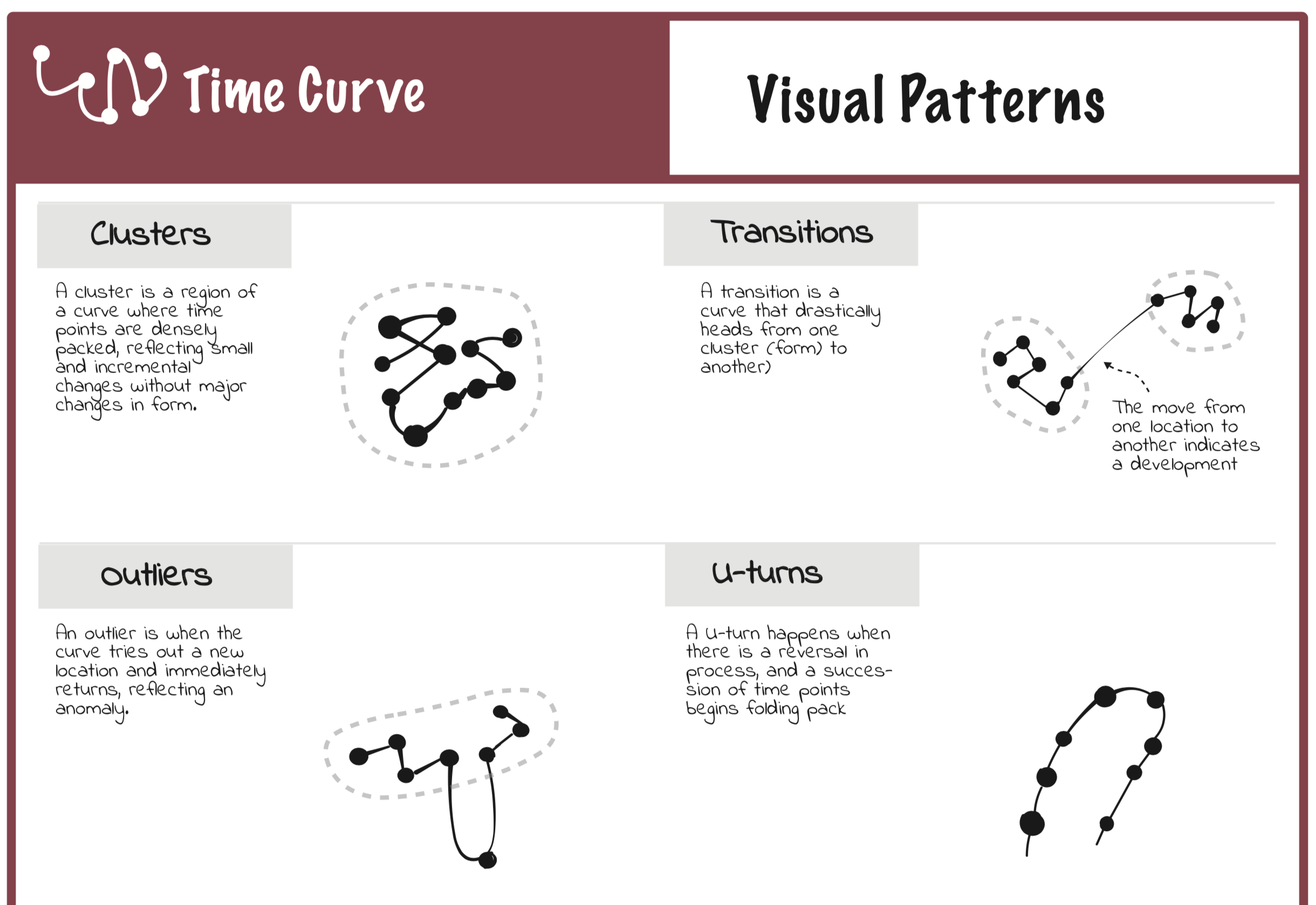 Visual patternssheet provide a catalogue of meaningful patterns visible in a visualization. Patterns are key in correctly interpreting visualizations and makingdiscoveries. A visual pattern can be any sort of configuration inthe visualization with a specific meaning.
Pitfalls
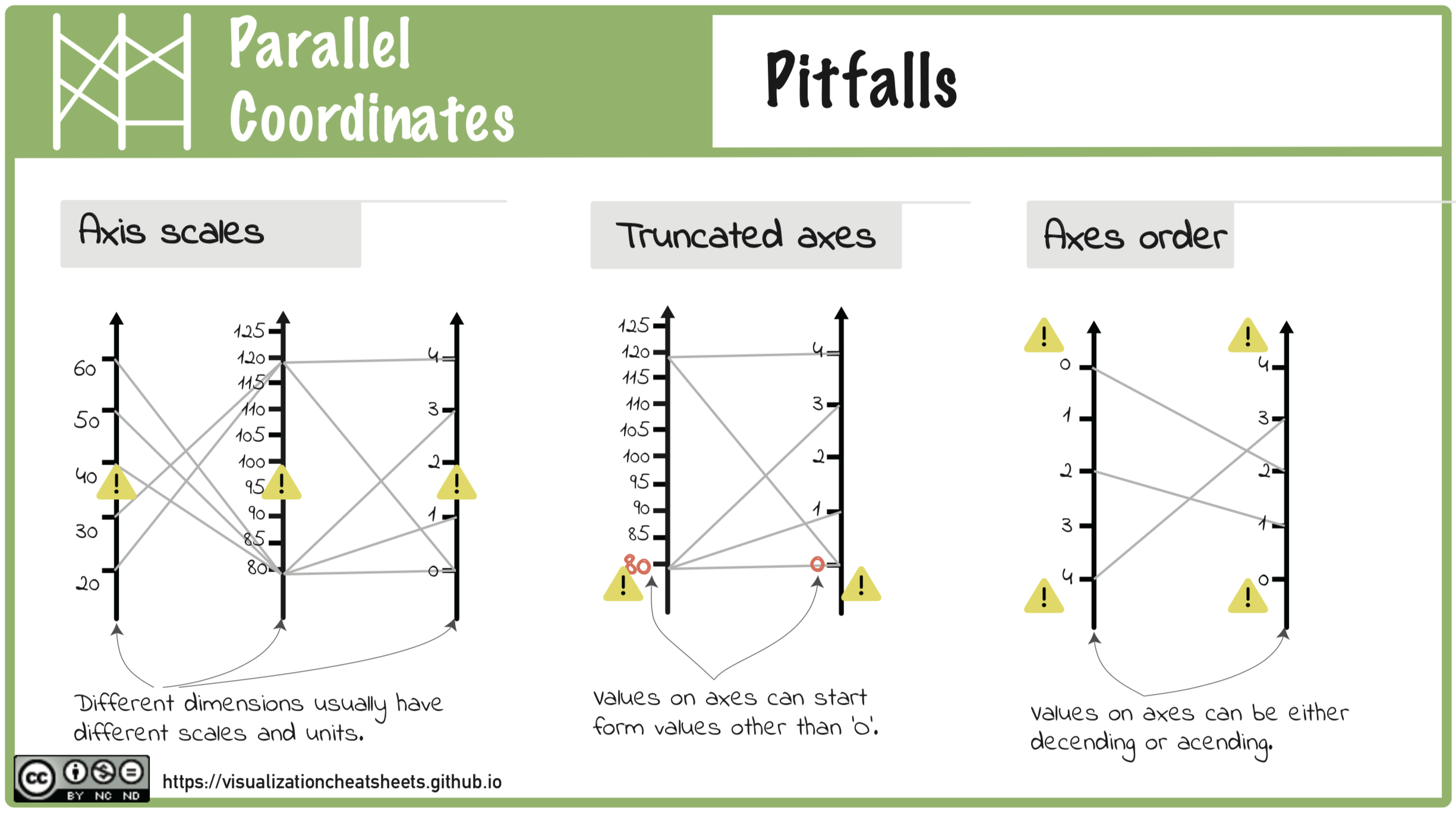 Pitfalls show possible misinterpretations of a visualization. While there is a long list of technique independent pitfalls.
Well-known Relative
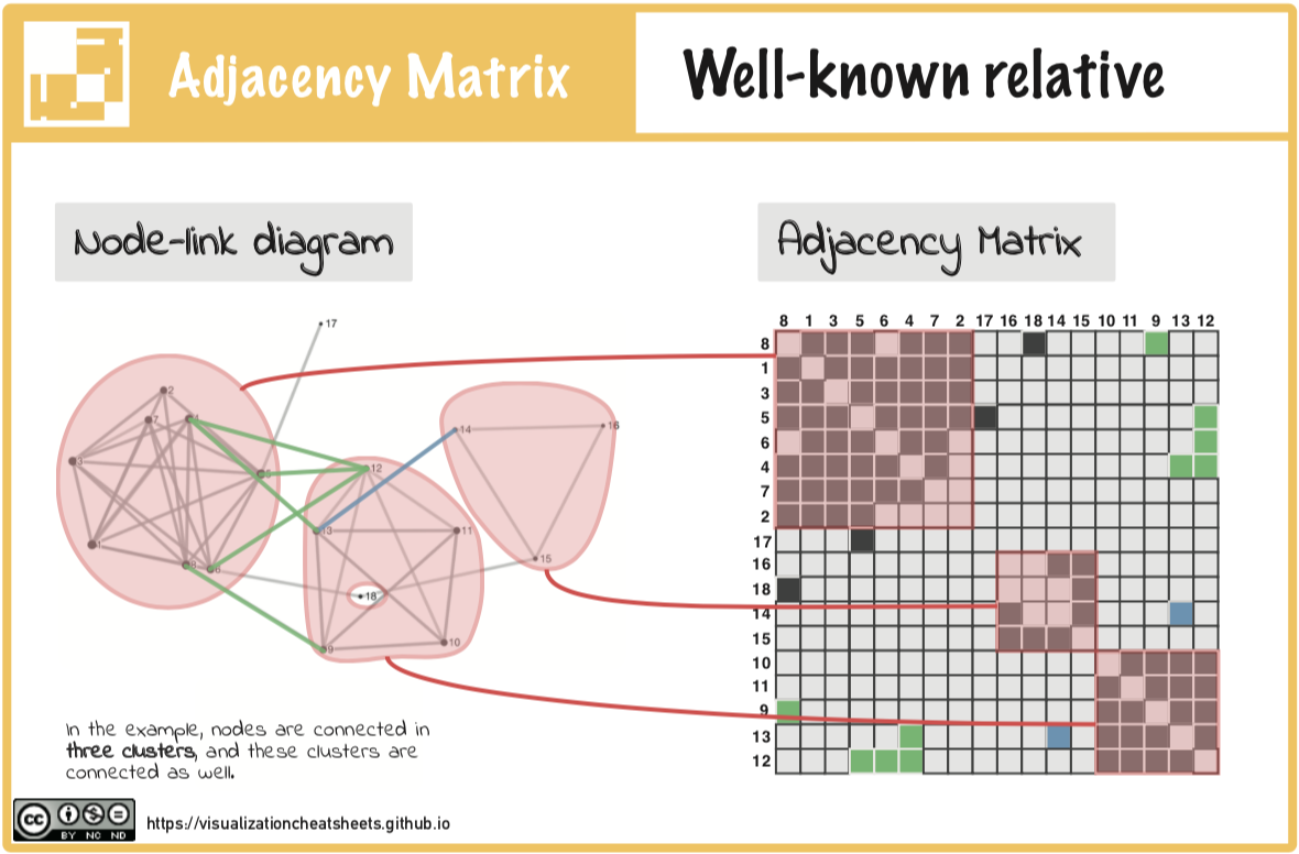 The “well-known relative” relates an unknown visualization to a more familiar one used to visualize the same data.
False Friends
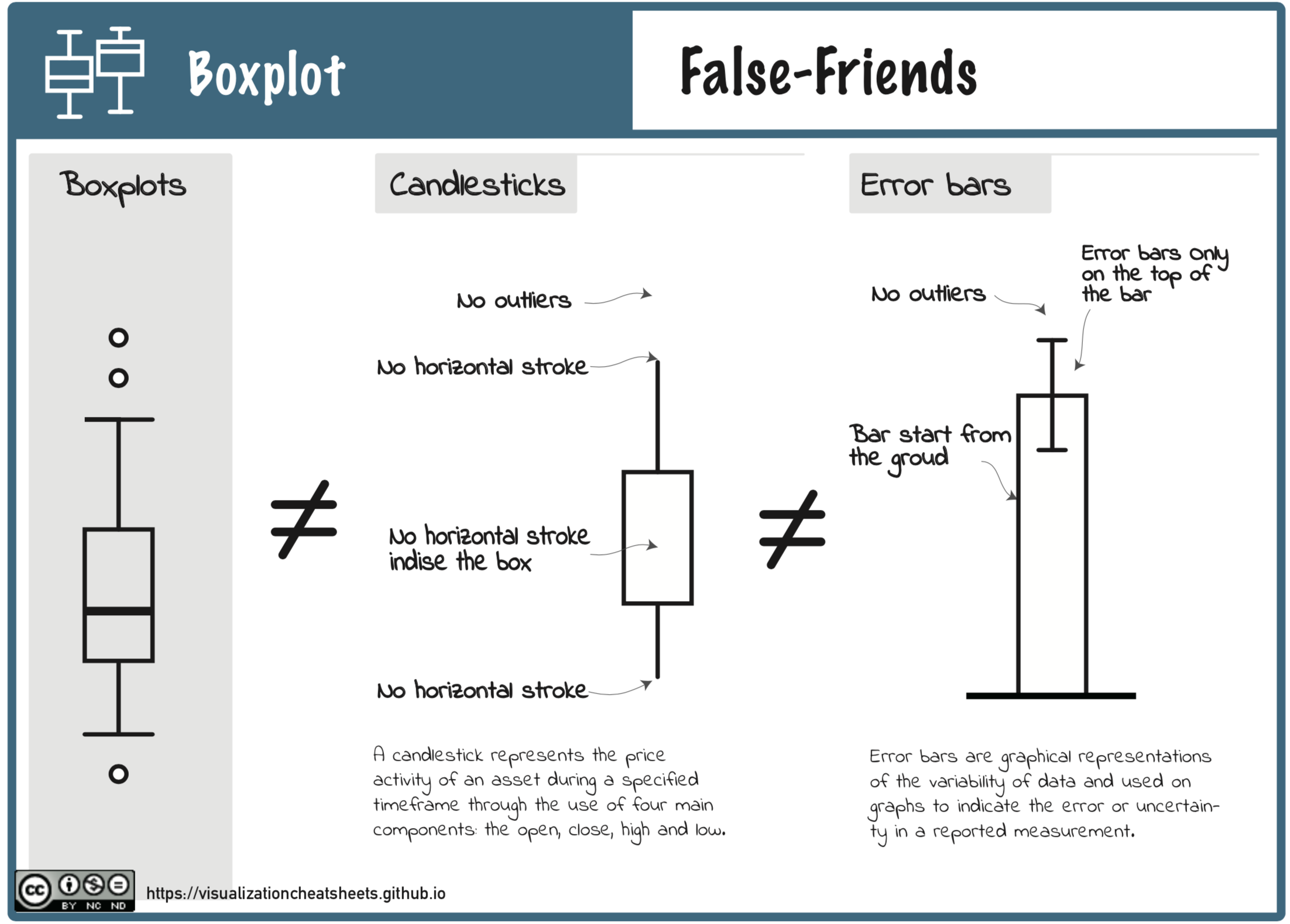 False-friendslists visualization techniques that are visually similar but functionally different. For example, boxplots share visualsimilarities with candlestick charts and error bars in bar chars; parallel coordinates can look similar to line charts, time curvescan look similar to connected scatter plots.